
All maps are wrong (but some are useful)
Org charts are often missing details relevant to everday work. What does a more useful organizational chart look like?
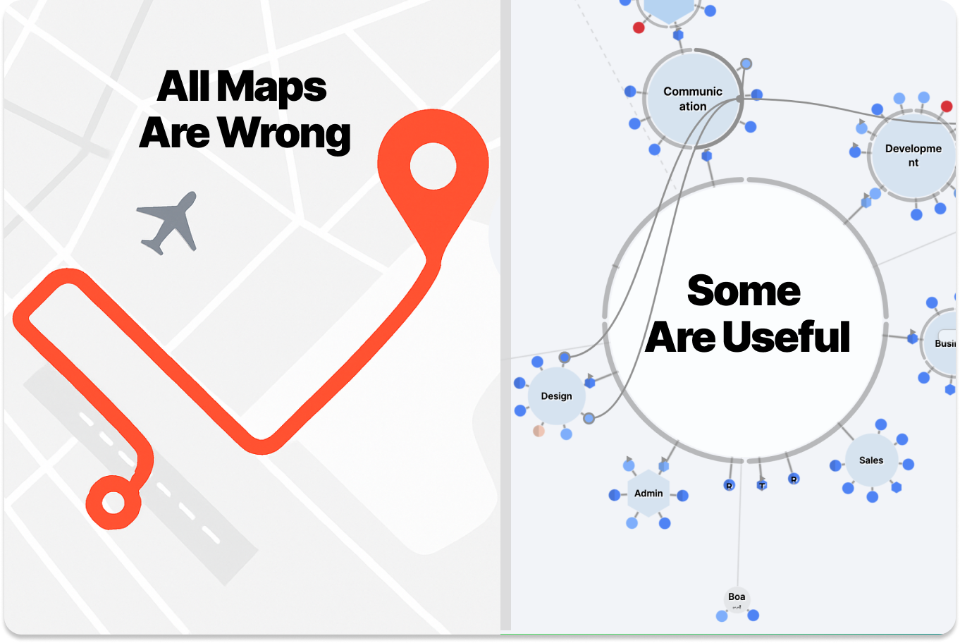
Imagine you are looking for a small town in Australia, trusting your GPS, and you end up in the dry outback because the town on your screen is not actually there. Or, what if your map app guides you toward an airport terminal and you realize you are in the middle of the runway? These map mishaps point to a simple truth statistician George Box put best:
“All models are wrong, but some are useful.”
A map is an imperfect model. It's an approximation of the territory. The real test is whether its imperfections still help you find your way.
The same question applies to how we chart organizations. What kind of org chart actually helps people navigate their work and relationships?
Traditional org charts: Useless maps?
Most org charts are static diagrams of job titles and reporting lines. They display who’s officially in charge of whom and who belongs to which functional unit, but little else. These charts might be useful for compliance, but for day-to-day collaboration, they’re often misleading.
They fail to show:
- Who’s actually responsible for what.
- How people interact across silos.
- What skills or competencies are in house.
- Shifting priorities, goals, or constraints.
- Nuanced relationships such as mentoring, informal leadership, and peer influence.
Traditional org charts are clean on paper, but too vague and incomplete to be a useful reference for everyday work. They are a sketched treasure map on the back of a napkin.

How do you make an organization map useful?
Most work refuses to stay inside boxes. People step into gaps, swarm to solve urgent problems, and lend expertise across teams. A useful organizational map increases resolution. It shows responsibilities, relationships, and current priorities. It also makes informal contributions visible, so the team can learn from them and recognize real capacity.

So, if we want a more useful model, something like a GPS for working together, then we need to decide what’s worth mapping. Some critical elements include:
1. Roles and responsibilities (who does what)
Instead of just job titles, useful org maps show real roles people are working within, possibly multiple ones across multiple teams. These should be flexible and reflect how work is actually distributed.
2. Relationships (who interacts with whom)
Not just “who reports to whom,” but who collaborates, who mentors, who depends on whose work, who gives input, and who has veto power. Think of this as the roads between the cities.
3. Decision rights (who decides what)
Clear authority and boundaries: who gets to make which decisions, and where consent or consultation is needed. Otherwise, you get traffic jams at every crossroads.
4. Constraints and priorities
Your map should reflect the changing landscape. This includes available capacity, shifting objectives, and active projects. This is the elevation data and weather of the org. It is what adds dimensionality to your map, making navigation realistic.
5. People (not just positions)
People change roles, take on new responsibilities, leave, or grow. A useful map follows their individual paths through a living system, not the org-as-it-was-six-months-ago.
A map is a shared model
Most importantly, a useful map is shared. If only leadership or one department sees it, or if different teams have conflicting versions, it ceases to be a common point of reference. Like a bad GPS, it can guide people in very different directions. Decision quality goes down if information is not evenly spread.
The goal is not to create a perfect map. Aim for a useful one. One that helps people orient themselves, find collaborators, and move with clarity.
So the next time you’re squinting at an org chart, ask yourself: Is this map helping us get where we need to go, or might it lead us onto a runway?